Good marketing is often about using skills associated with the right side of the brain: storytelling, imagination, intuition, etc. But great marketing includes the other hemisphere as well.
We’re talking science, of course. A closer look at human behavior and why it is we do the things we do reveals a number of concepts that can be applied to marketing messaging and content. The results not only manifest a strong sense of creativity, but also trigger inherent behaviors in prospective clients that can work to a business’s benefit in both the short and long term.
These behaviors are always a hot topic in the marketing world and are useful for developing effective marketing strategies. Listen to a deep dive on the topic on an episode of the Commerce Experience podcast:
Listen to “Unlock the Psychology of Your Customers with Monica Sharma-Patnekar” on Spreaker.
Luckily, you don’t need to be a consumer psychologist to understand these behaviors. In this guide, we’ll review a number of behavioral principles and show you how a leading ecommerce store has successfully applied them to their marketing efforts for greater conversion rates.
We’ll also walk you through the buying process step-by-step in a real-life case study. By using concrete examples of strategies and insights, you’ll learn both how and why they work.
You’ll walk away with knowledge of how to use the psychology of marketing to boost your ecommerce sales and ensure your customers keep coming back. These learnings are based on how human psychology works and you can replicate them in any e-shop.
Along the way, we’ll also give you specific tips on how Bloomreach can help you get started.
What Is Marketing Psychology?
Before we dive into the analysis, you should understand how and why marketers use psychology to influence consumers.
Let’s start with the basics.
Marketing Psychology Definition
To give you a proper definition, marketing psychology is a branch of applied psychology which studies the factors that influence consumers’ attitudes toward products or services.
Simply put, it looks at how presenting a product affects the consumer’s behavior.
Marketers use these psychological principles to predict how consumers will act and to find ways to influence their decisions. Making a product seem desirable or attractive is one example.
Marketing psychology closely relates to consumer behavior: the study of how and why we purchase products and services.
Borrowing insights from behavioral sciences, such as neuroscience and cognitive sciences, marketing psychology looks at how personal factors, like people’s feelings and perceptions, influence their buying habits.
Heuristics and Cognitive Biases — What They Are and Why We Need Them
Marketing psychology borrows a lot from behavioral sciences, such as neuroscience, cognitive sciences, and other fields that study how the brain works.
Although people like to believe that they make rational, well-thought-out decisions, the opposite is often true. The amount of information that your brain absorbs in a day is just too much to analyze.
To help us make faster decisions, our brains developed shortcuts that help them process information selectively. These shortcuts are called heuristics.
You can think of them as rules of thumb. For example, let’s say a freshman in college is shopping on his own for the first time. He heads down the detergent aisle and passes 15 different detergents he knows nothing about in order to get to the Tide section, which is a brand he trusts simply because it’s what his parents use at home. If he knew more about the 15 different brands he ignored, there’s a good chance he’d choose to try one of them over his old standby, but this mental shortcut prevents that.
Unfortunately, heuristics often cause errors in our judgments and result in cognitive biases.
Cognitive biases describe irrational tendencies in decision-making. They can affect how consumers make purchase decisions and perceive your brand.
Understanding cognitive biases is crucial for understanding consumers — you’ll be able to read your customers’ minds better and design your product or your marketing strategy accordingly.
What Is the Value of Marketing Psychology for Marketers?
There is a huge value for marketers in using these approaches for their marketing strategies.
But it’s not as simple as copying out-of-context strategies and throwing around popular buzzwords. The key is knowing how these strategies can work together.
Understanding consumer attitudes and how they make decisions enables you to create a strong, targeted marketing strategy that yields conversions. You can use it to improve your marketing campaigns and reach your customers faster.
The application of psychology in marketing is by no means a new enterprise. Business organizations and professionals from all over the globe have endeavored to use behavioral patterns to their advantage over the years. The difference now, of course, is that there’s technology sophisticated enough to support these initiatives in a much more effective way.
Introduction to Case Study: In-Depth Behavioral Analysis of One of Central Europe’s Largest E-Shops
Now that you have a basic understanding of consumer psychology, let’s dive into the actual application of it.
In the following chapter, we’ll walk you through a typical online buying process:
- The first website visit
- Browsing products
- Consideration
- The purchase
Our case study focuses on one of the largest online computer and electronics stores in Europe. It sets the direction for its competitors in the region. In 2019, this fast-growing store more than tripled its annual income from the previous year.
Their secret weapon: an exemplary marketing strategy rooted in consumer psychology.
These psychological principles are based on human behavior and they apply across the board, whether you’re in the US or elsewhere. When used well, they can boost your sales and make buyers never want to shop anywhere else.
Despite the differences between the US and European markets in terms of buyers’ expectations and online shopping behavior, you’ll still find many practical tips by studying what this e-shop does.
To show our findings as clearly as possible, we’ll share a simplified, anonymized version of their site with you.
Are you ready? Let’s dive right in.
Practical Application of Marketing Psychology in Ecommerce
In this section, we’ll take you through the purchasing process in our chosen e-shop, pointing out insights along the way. These insights will show you how to influence consumer behavior and your customers’ choices while making them feel empowered.
Here’s our scenario.
Imagine you set out to buy a new mobile phone. Your buying process will consist of five steps:
- The first visit = Attention phase
- Browsing products = Interest phase
- Considering the options = Consideration phase
- Making the final decision = Decision phase
- Making the big purchase = Action phase
We’ll take a look at each of these steps in detail. Throughout the process, we’ll also analyze the strategies our e-shop uses to nudge you toward purchase, and explain how and why they work according to consumer psychology.
Let’s get shopping.
Applying Marketing Psychology to the Homepage
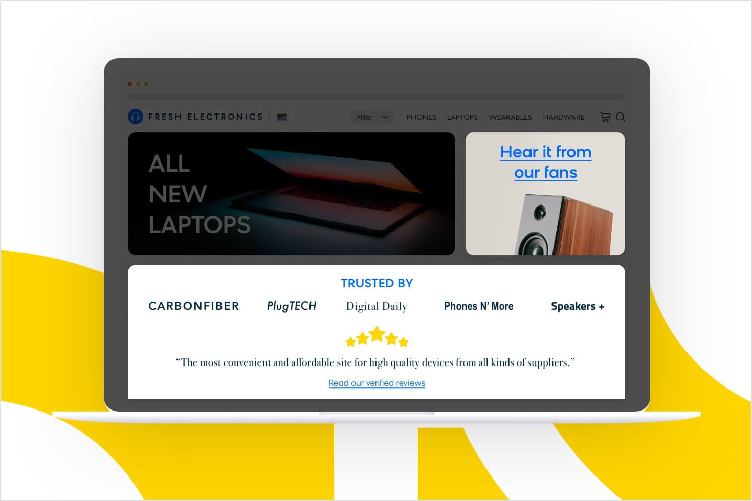
Welcome. You just landed on the e-shop’s homepage. Most likely, your search engine has taken you to the e-shop’s landing page for your home country.
Though Fresh Electronics is a global company, the first thing you see is a landing page tailored to your country, including reviews from customers in the local language. Even if it’s your first time on Fresh Electronics’ site, you won’t find it hard to trust its offerings if you see positive reviews from like-minded consumers.
This marketing psychology principle is known as social proof. It says that to decide what is correct, people look to others to see what they think is right. The more you see others do something, the more you perceive it as correct behavior because your brain judges that they might know more about the situation.
In Fresh Electronics’ case, the more positive reviews you read from other website visitors, the likelier you are to trust the e-shop with your purchase.
Applying Marketing Psychology to the Category Page (Part 1)
Browsing Products and Categories
You’ve decided Fresh Electronics is trustworthy, so now it’s time to look through its offers. As you’re browsing through its products and categories, you might not realize that these too have been deliberately organized to influence your decision-making process.
Let’s look at each section in detail.
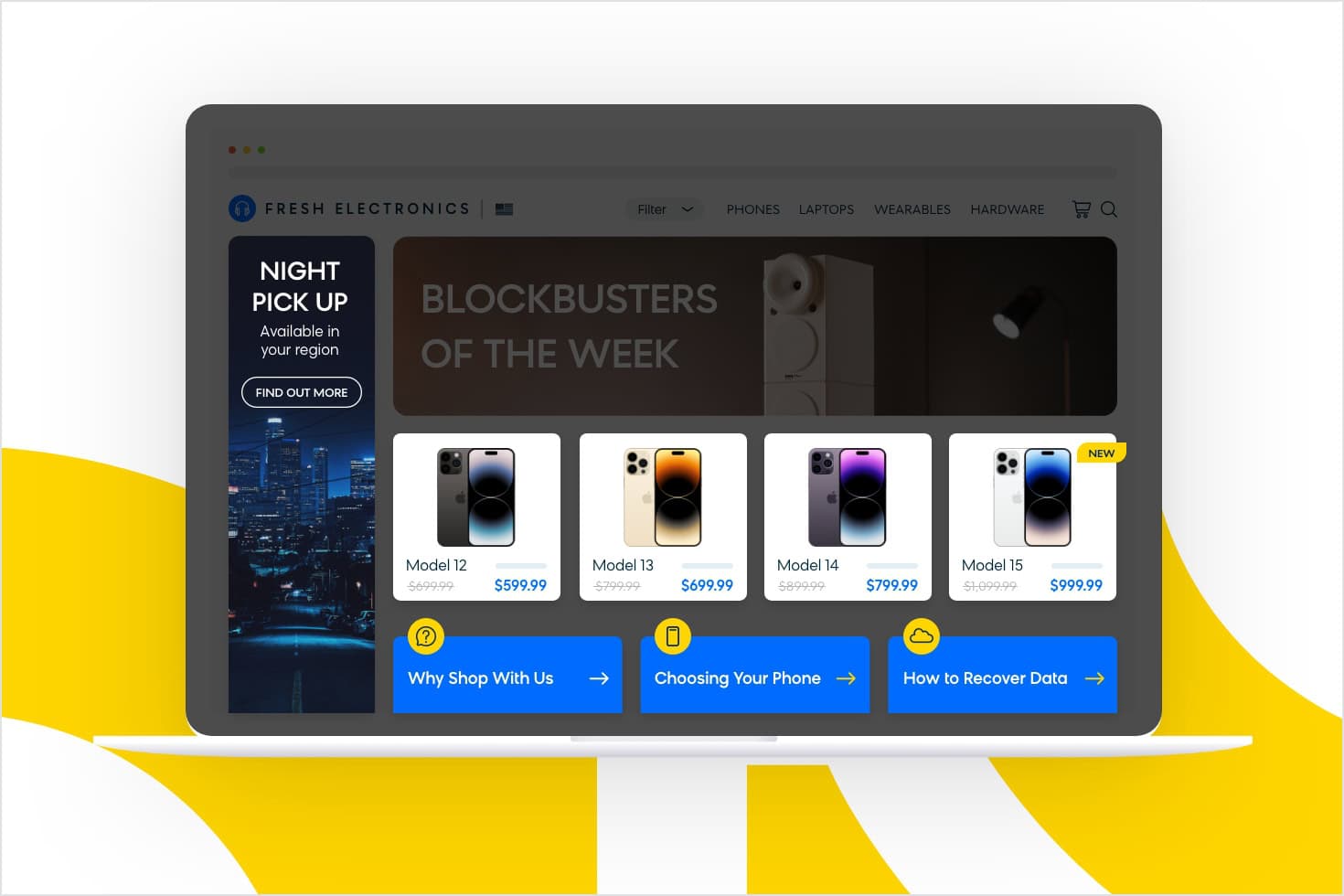
Night Pickup Availability (Hyperbolic Discounting)
Starting with the left-hand banner ad, there’s a message that reads: “Night pickup is available in your region.” Here, Fresh Electronics is employing a cognitive bias called hyperbolic discounting. This bias explains our tendency to value the immediacy of time over the higher value of money.
For instance, if someone offered you $100 today or $200 one year from now, which would you take? $200 is obviously a greater amount, but would you wait that long for it? Statistically speaking, probably not. Similarly, if you’re eager for a new cell phone and there’s a model available for pickup in your area that very same evening, there’s a good chance you’ll pay a little extra for it rather than pay less to wait, say, a week for delivery.
What this means for your brand is that you should always offer fast delivery options, even if the cost is higher. To give you another example, a limited-time offer of next-day delivery if the customer purchases your product immediately will have a similar effect.
Bloomreach weblayers let you add hyperbolic discounting messages directly on your site, shown to the target audience of your choice. This lets you show messages like “Night Pickup in Your Region” only to customers living in a specific area.
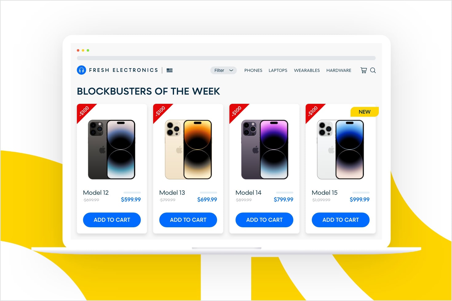
Blockbusters of the Week (The Scarcity Effect)
Next on the Fresh Electronics site, you notice its “Blockbusters of the week” section. These are temporarily discounted products. The deals could last a few hours, a day, a week, etc. After that, the price goes back to the initial price.
This strategy, which aims to encourage you to purchase immediately, is rooted in the exclusivity scarcity heuristic. The scarcity heuristic says that humans place a higher value on an object that’s scarce and a lower value on those that are in abundance. For example, gold is more valuable than copper because gold is not as abundant.
These short-term deals can also drive people back to your site by playing on the fear of missing out (FOMO). The fear of missing out taps into social psychology and can lead to concerns that one might miss an opportunity for social interaction, a novel experience, or a profitable investment. In this case, you wouldn’t want to miss out on a great deal, so you might check back regularly to see what’s on sale or if something you wanted is still on sale.
Bloomreach customers regularly use the scarcity effect to drive conversions. A particularly popular technique is a countdown banner, which can be created with a Bloomreach weblayer.
Educating Your Customers (Reciprocity)
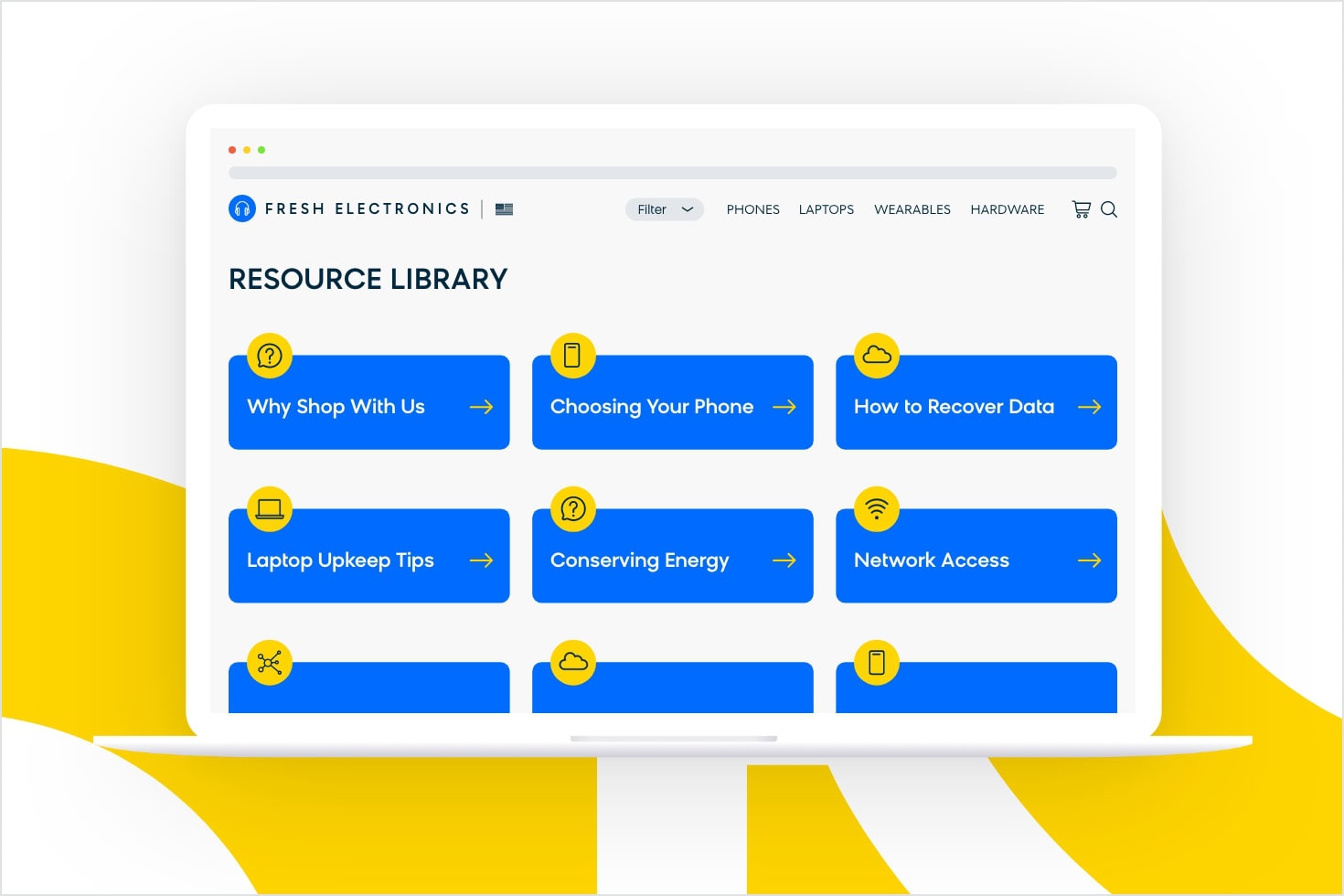
At this point, Fresh Electronics seems like a trustworthy shop for the purchase you have in mind, and there are good deals to boot. But there’s still room for more marketing tactics to influence purchasing decisions. When you get to the bottom of the page, you notice a menu of links with different education-based pages for you to explore:
- Why Fresh Electronics
- How To Choose a Phone
- How To Recover Data
The first page lists the benefits of shopping at this particular site, the second offers tips on choosing the type of device you’re in the market for, and the third gives advice on how to switch from your existing device to the one you’re about to purchase. All in all, it’s everything you need to know to make a well-informed purchase and more easily transition to your new device.
The principle being utilized here is called reciprocity. The rule of reciprocity says that people will feel a sense of indebtedness if you give them something, even when faced with an uninvited favor. In this case, Fresh Electronics is using the reciprocity principle to trigger more sales in exchange for clear and valuable instructions. Doing something extra for your prospects in this way, such as guiding them through the purchase process, can help you turn them into returning customers.
Educational articles like these can also work double time by boosting your SEO or serve as repurposed content in your marketing campaigns.
Applying Marketing Psychology to the Category Page (Part 2)
Considering Which Phone You Should Choose
After you’ve browsed for a bit, you’re finally getting down to choosing which phone is right for you.
The tactics that our e-shop uses here can be explained by four behavioral principles that “nudge” you, the customer, in a certain direction:
- The naming and framing of categories
- Driving the customer toward the middle choice
- Empowering customers to make a decision
- Putting the products into context
The Naming and Framing of Categories (The Framing Effect)
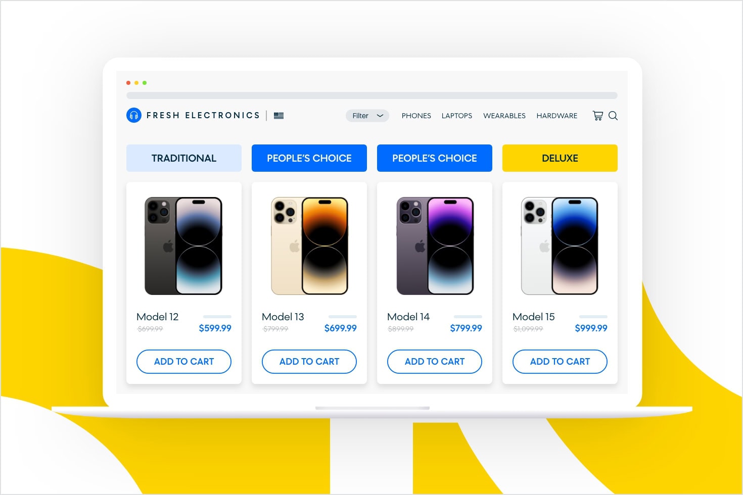
You’ve narrowed down your decision to a couple of different options and now it’s time to decide how much money you’re willing to spend on this phone. At this stage of the process, Fresh Electronics offers assistance by categorizing their devices into three different pricing groups:
- Traditional
- People’s Choice
- Deluxe
One of the reasons for categorizing devices is that consumers make different choices depending on how they’re presented. Marketers call this strategy the framing effect.
The framing effect is a cognitive bias in which people decide on options based on whether they’re presented with positive or negative connotations (e.g., as a loss or gain). In our example above, the least expensive option on the far left is named “Traditional” rather than “Cheapest” in order to soften the potentially negative connotation that being cheap might evoke.
Its opposite, the most expensive category, is called “Deluxe” in order to appeal to the high-end buyer who’s willing to spend a premium. By not outright saying the devices in the third category are extremely expensive, the category appeals to the desire for a luxurious experience.
Driving the Customer Toward the Middle Choice (The Center-Stage Effect)
Having three categories is not accidental, either.
- Traditional
- People’s Choice = Middle Option
- Deluxe
Let’s say that when it comes to your mobile purchase, you don’t want to spend too much but you also want something of good quality. You’d be in the same boat as the majority of consumers who, when presented with a number of offers, have a tendency to choose the middle option.
This principle is called the center-stage effect. The theory suggests that consumers believe options placed in the center of a simultaneously presented array are the best bet. This belief translates into choosing options placed in the center more often than those at either end of the display.
You’ll notice how many companies will give their middle-road pricing package special treatment when it comes to design, like a “Most popular choice!” banner. Following suit in your own pricing package design can help you increase the sales of certain products or services.
Empowering Customers To Make a Decision
You might be wondering why there are two products with similar parameters and prices offered in the middle category.
One way to explain this is the notion of customer empowerment. It’s human tendency for people to connect their buying experience with the amount of control they have in the process.
So, when you give your customers a choice between two very similar options and let them make their decision, you’ll create a better buying experience and, ultimately, it can help you turn site visitors into loyal customers.
Putting the Products Into Context (Anchoring)
One problem that ecommerce businesses often face is the high number of products being offered.
Imagine that while you’re browsing Fresh Electronics, you’re also checking out another shop in the next tab. They too have a lot of offerings in the mobile device category, but they’re not presented in an organized way. You can’t sort products by their value or their condition, so there’s no telling which is high-end, which is middle-of-the-road, which is used or new, and so on. Without categories, the number of choices ultimately feels too great. So, overwhelmed, you close out of the window and head back to Fresh Electronics.
The reason the Fresh Electronics site is so much easier to visually and mentally process is because it employs a principle called anchoring.
Anchoring tells us our brains don’t consider the value of an option based on its intrinsic value. Instead, we compare different offers against one another and ultimately make decisions based on those comparative values. In other words, we “anchor” our decision-making process to the surrounding situation, rather than thinking rationally to make the best decision overall.
Fresh Electronics anchors you by showing only four products to start, categorized into three groups. This creates a baseline to which you can compare all other mobile offerings. In the end, it’s likely this anchor that will influence your perception of value and final purchase decision.
Applying Marketing Psychology to the Product Page
Making the Final Decision
In a time when shopping online is the norm, there’s one thing that can help you stand out from your competition: helping people make better choices and creating an experience that sweeps your customers off their feet.
This is where choice architecture and nudge theory comes into play.
It’s not just the anchoring that makes someone feel secure with their shop of choice. There’s a whole microcosm of activity happening on the site; small things they might not be able to place or articulate, but somehow they add up to a strong preference for Fresh Electronics. This is known as nudge theory.
A nudge makes it more likely that an individual will make a particular choice or behave in a particular way by altering the environment so that automatic cognitive processes are triggered to favor the desired outcome. Most important to remember: It’s a gentle suggestion, not a mandate.
There are a number of behavioral strategies and principles in place here to nudge the customer in a certain direction. Let’s look at them in more detail.
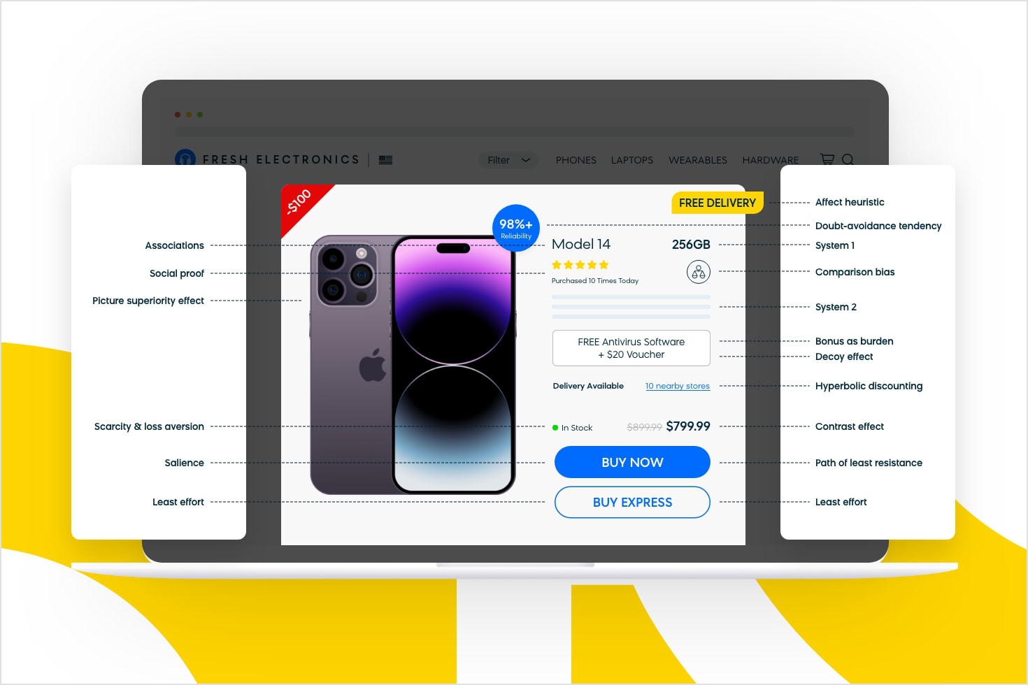
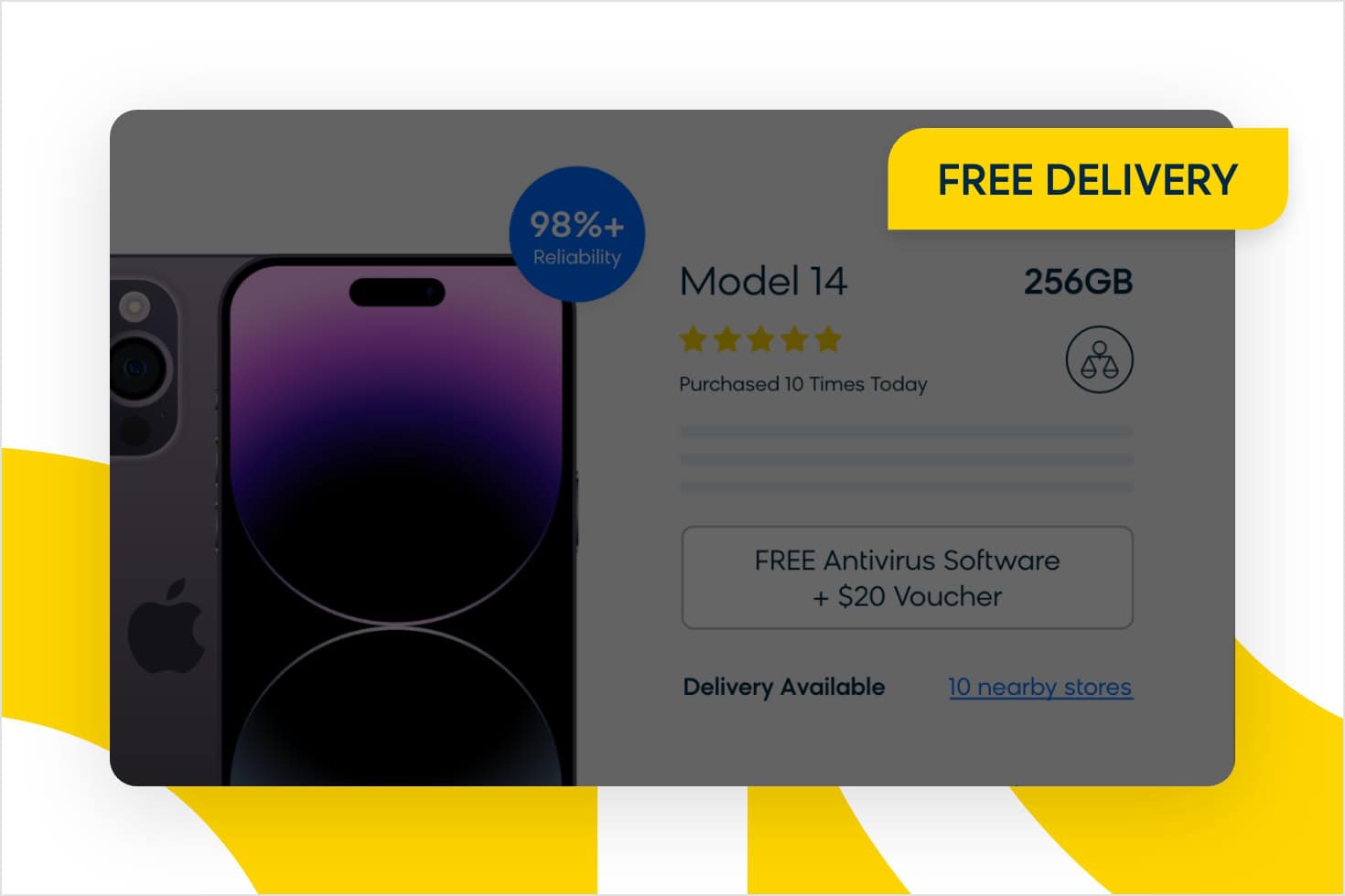
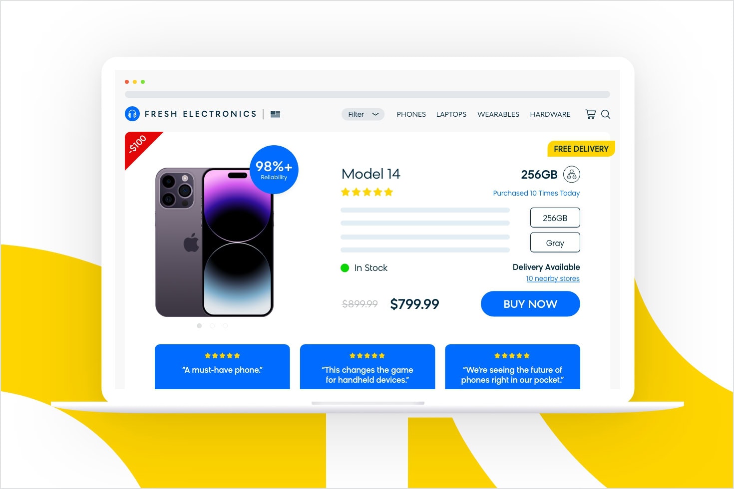
Here is what our e-shop shows about the product.
Doubt-Avoidance Tendency
When your brain feels uncertain about something, it will often simply avoid making a decision. This is called doubt avoidance.
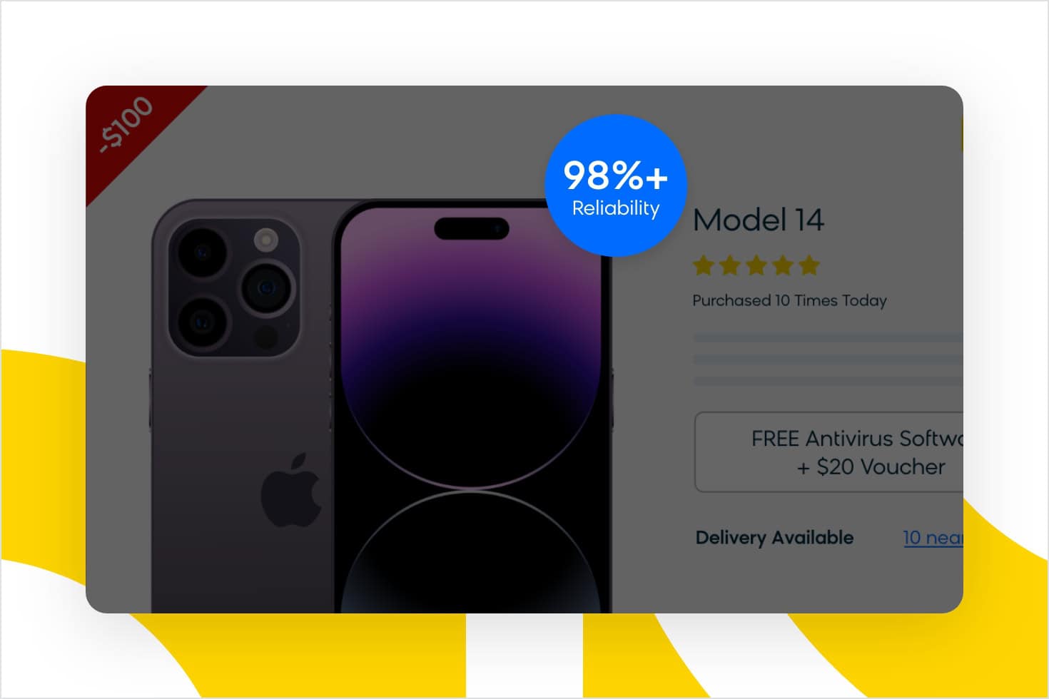
Using icons or text on your product or service banners such as “Over 98% reliability” is a great way to instill trust in your customers’ minds. It creates a positive notion or feeling about the product, removing doubts and encouraging conversions. Other icons that highlight product benefits can include: waterproof, eco-friendly, and so on.
Affect Heuristic (Zero Price Effect)
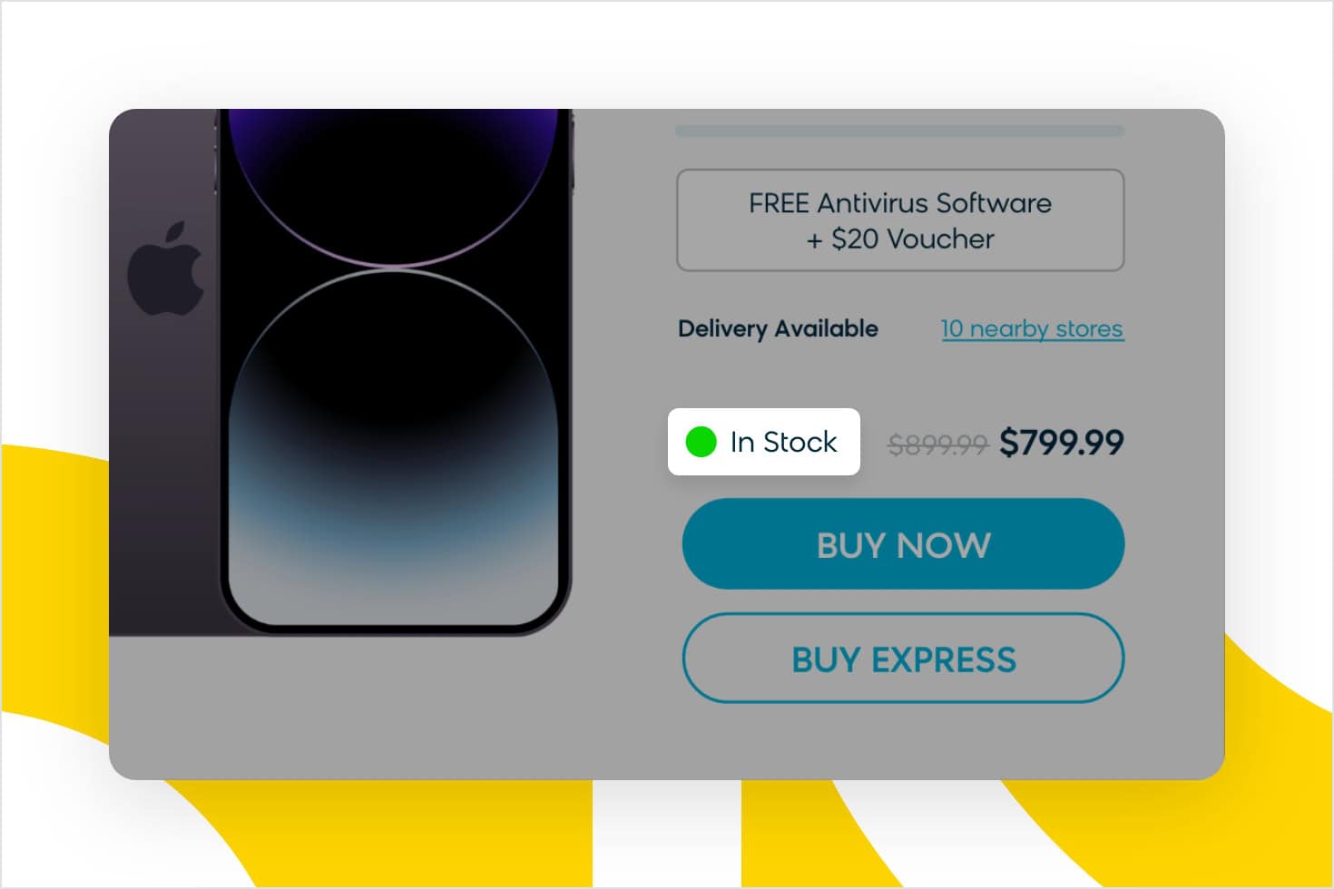
By highlighting free benefits, you can create a positive response in the customers’ minds while they’re browsing your products and services. This is explained by the affect heuristic. Free options trigger a more positive response from the brain than those that come with a cost. The outcome is the zero price effect, which suggests that people do not simply subtract costs from benefits but instead they perceive the benefits associated with free products as higher.
Not only that, but free add-ons are fast becoming one of the key factors in consumer decisions. According to a report from NRF, 75% of consumers surveyed expect delivery to be free even on orders under $50, up from 68% previously. What’s more, “unexpected costs” is the top reason why people abandon shopping carts.
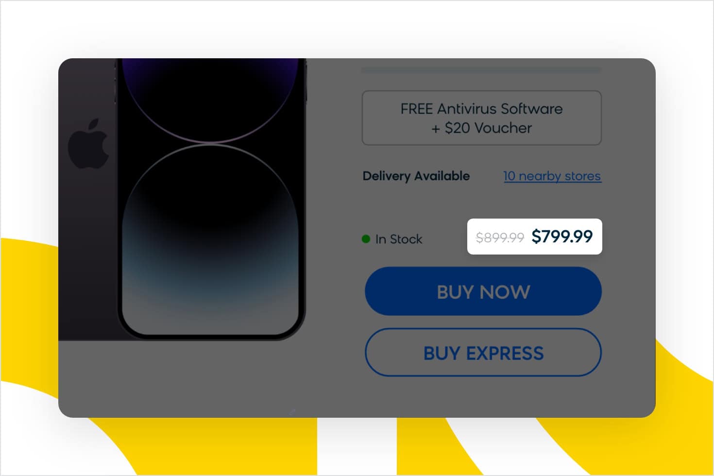
If you’re offering freebies as a purchasing incentive, try showing a slash mark through the original price of the item. A better understanding of exactly how much they’re getting for free will persuade consumers to follow through with their purchase.
Scarcity Heuristic and Loss Aversion
We’ve already mentioned the scarcity heuristic. It says that when a product is less readily available, be it because of limited time or quantity, we tend to perceive it as more valuable. Ecommerce brands use this strategy to drive people to purchase. Including such an icon on your product detail page can help you prompt your customers to buy.
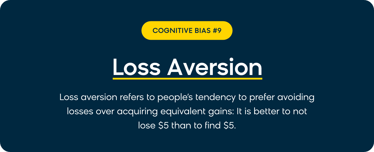
The concept of loss aversion can also help us out here. It means that people perceive the psychological pain of losing something as being twice as powerful as the pleasure of gaining.
What does it mean for your digital marketing? The mere possibility of losing the chance to buy what you want can be a strong driver for people to buy. Imagine you see that an item you’re looking at has been sold five times this week. You don’t know if there are seven items in stock or 700. Would you take the chance of waiting to purchase later, now that you’ve found what you were looking for?
The Contrast Effect
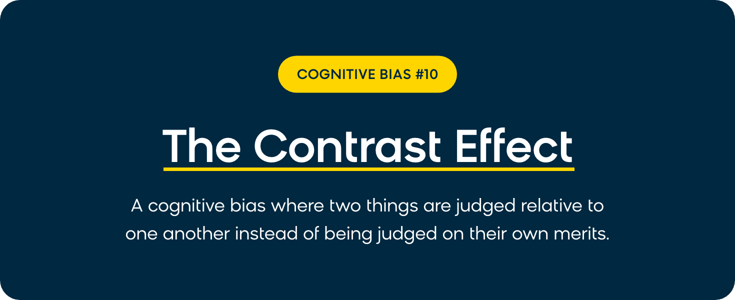
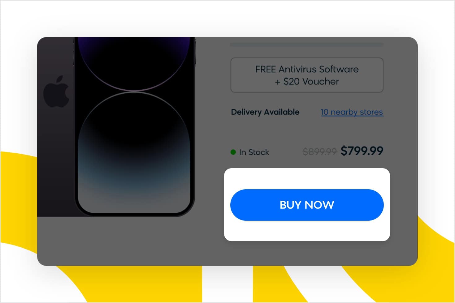
When you compare two things against each other, you might get a distorted perception if one or more differences are enhanced. This is caused by a cognitive bias called the contrast effect.
The comparison can be explicit or implicit, and it can apply to any qualities or features, including price. In practice, when you compare an expensive product to a more costly one, it will make the product appear cheaper than it actually is.
The Salience Bias
We borrowed this consumer psychology principle from neuroscience. Salience bias, also referred to as perceptual salience, says that people will focus on the more prominent information and ignore the less prominent. It creates an inclination towards the more striking, noticeable messages, usually due to a high contrast between them.
Our e-shop uses this tactic to bring your attention to a special deal marked with a yellow highlight. These are the time-limited offers that the e-shop wants to highlight among all their other products.
The Principle of Least Effort
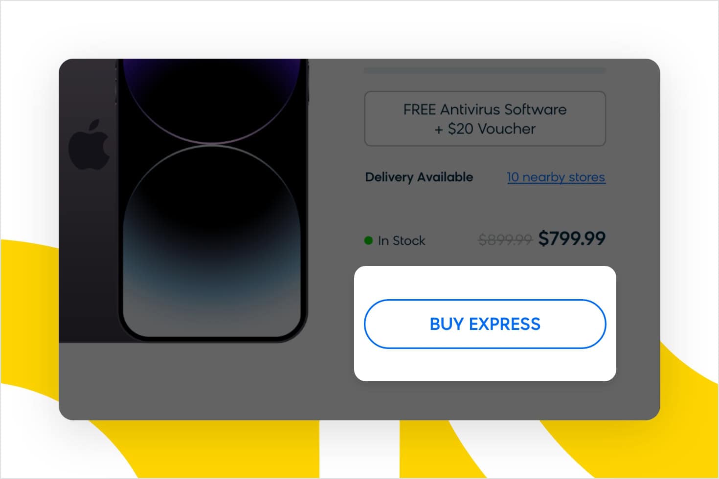
Finally, Fresh Electronics demonstrates an awareness of the principle of least resistance. This theory postulates that animals, people, and even well-designed machines will naturally choose the path of least resistance or “effort” when setting out to accomplish a task.
In the case of our e-shop’s potential customers, this means having the ability to choose the “Buy Express” option. This allows customers who have previously saved their details on the site to skip a few steps ahead in the purchasing process. Reducing the process to only a few clicks removes unnecessary friction and creates a better customer experience.
Applying Marketing Psychology to the Shopping Cart and Checkout
The Big Purchase
You’ve made it to the most important part of the process: the big purchase. Let’s take a look at how our e-shop helps its customers to address their needs and concerns at this most important stage.
Offering Extra Services Before the Purchase
To help you learn more about a given product, the e-shop allows you to open the product detail page by clicking on its image from the category page. Do so and here’s what you’ll see:
Note that many of the sales strategy techniques we’ve discussed earlier are also used on this page, but with even more emphasis: more reviews, more photos, and more content in general. As we get closer to purchase, the intensity of the tactics used increases.
You take it all in and you’re convinced. This is “The Phone” and you’re going to buy it. You click on “Add to cart.”
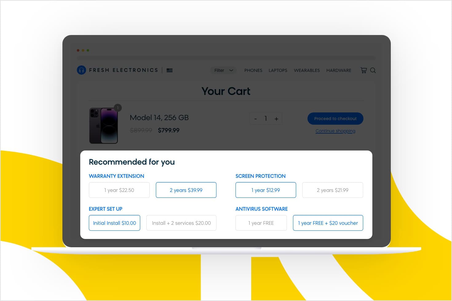
But wait, clicking on “Add to cart” doesn’t take you directly to the cart. The e-shop has added an extra step, where you can choose from add-ons and services to customize your new phone.
These add-on services include extending the warranty, insurance, and even adding a screen protector before they send you the phone.
To make your experience even smoother, the e-shop also offers the installation of antivirus software and an initial setup to save you time. No hassle for you whatsoever. If you were worried about setting up your new gadget, this sounds like a no-brainer, right?
But there’s more to it.
As you know, every extra step that your customers have to take before getting what they want increases friction and leads to lower customer satisfaction. However, this doesn’t apply if you add a step that will benefit them.
In our e-shop’s case, these extra services hit the nail on the head. The add-ons address what really concerns customers and demonstrates a deep understanding of their needs. Every product displays the add-ons that are tailored to its buyers’ biggest uncertainties.
This appeals to a tendency of the human brain to remove any concerns by making a decision quickly and impulsively. It’s called doubt-avoidance tendency.
At this point, the customers will likely say “yes” to an extra service if it helps them remove their doubts about purchasing. It’s a great way to push the customers toward buying and to upsell them, while also improving their experience.
The Shopping Cart
There are two things worth mentioning in the design of the shopping cart page.
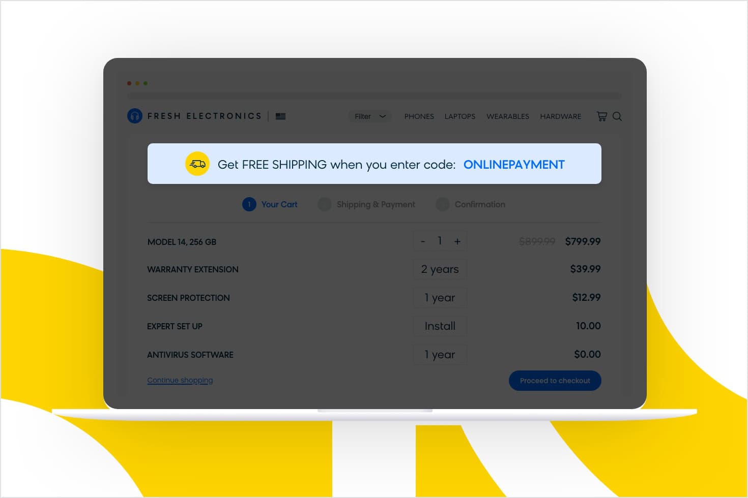
Subliminal Messaging To Drive You Toward Online Payment
During our analysis, the e-shop was running a marketing campaign around free delivery. According to their rules, you can get free delivery if your order is over $160 and you enter the code “ONLINEPAYMENT.”
They’re using a tactic called subliminal messaging. The code “ONLINEPAYMENT” is a message designed to appeal to the unconscious and nudge the customer toward a desired action: online payment, even though it’s not a condition of the offer.
Displaying Similar Products
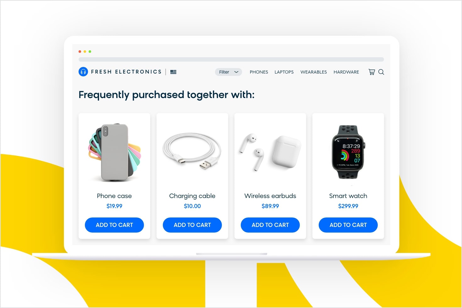
When you look at the items in your cart, you’ll notice another section just underneath them: recommended products.
The e-shop uses collaborative filtering, a method for generating recommendations for a particular customer based on the preferences of other customers with similar characteristics.
The result is a set of personalized recommendations. If they’re relevant, they can increase the time customers spend on your website and prompt them to make more purchases.
Streamlining the Checkout Process
The golden rule that applies to the checkout process: remove all friction and make it simple and easy.
To do that, you can split the checkout process into a few smaller steps. This will help you manage your customers’ perceived effort. Make sure that customers feel that the actions they need to take are simple and easy.
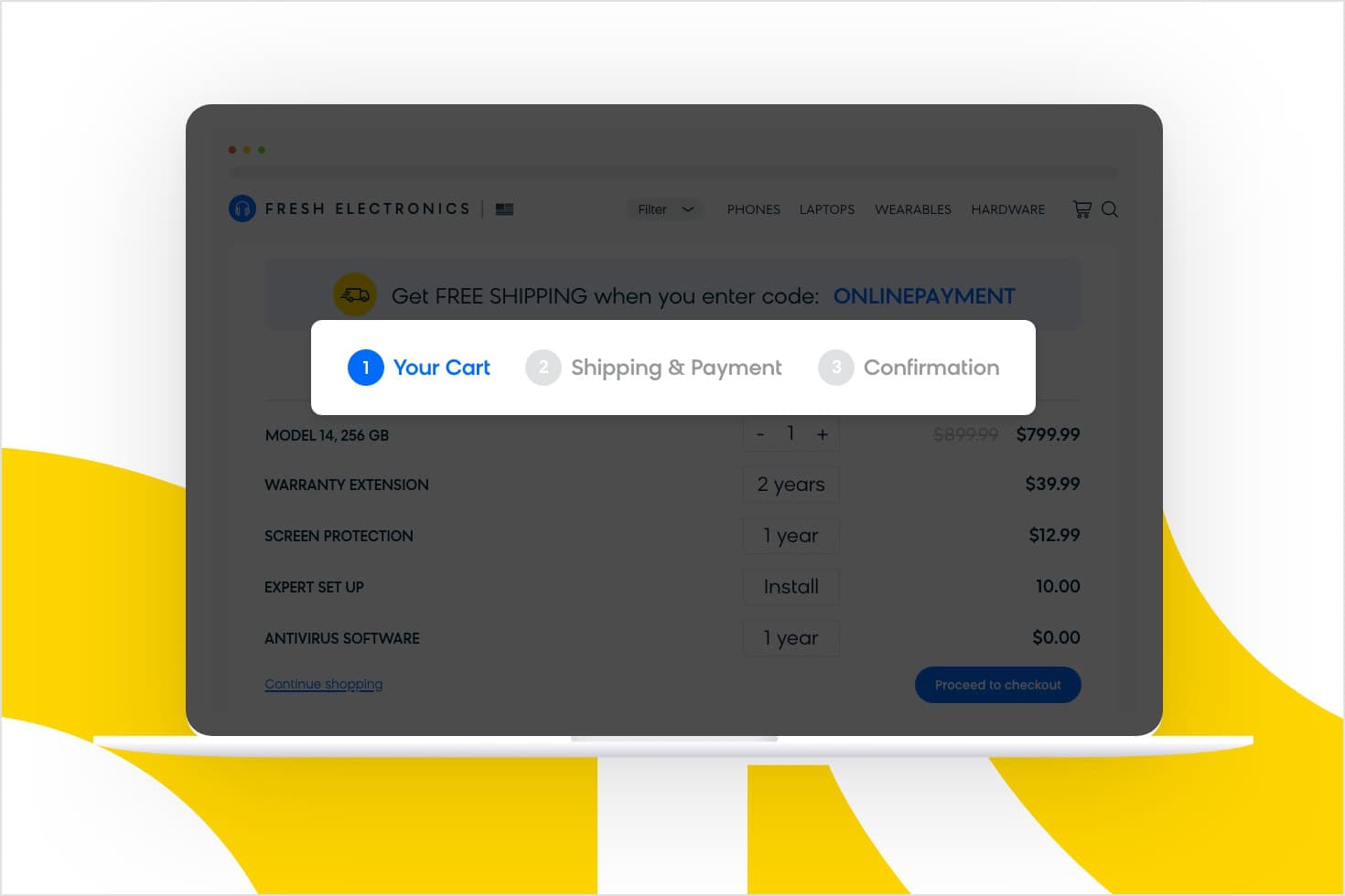
Our e-shop does this by breaking down the checkout process into three simple steps: the cart, shipping and payment options, and delivery details.
For each step, you can only access one section at a time. Each one has to be completed before moving to the next one.
Breaking the checkout into these three steps makes the process seem simple and reassures customers about how much more they need to do. This decreases the stress they might feel when they see one long form that needs completing.
Registration Before Placing Your Order
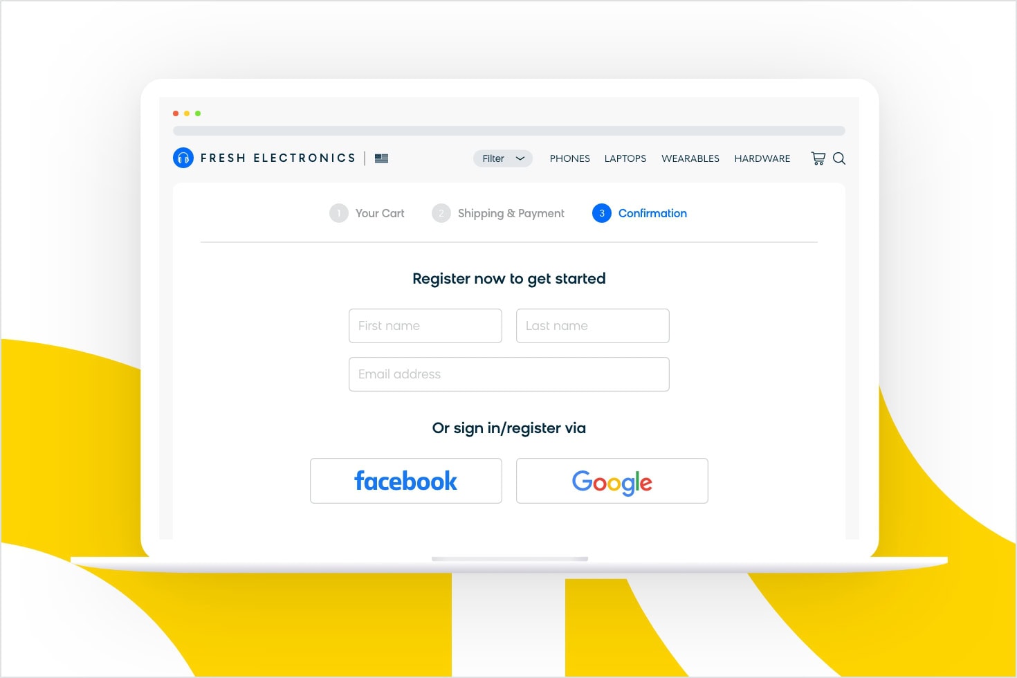
In the last step, in the “delivery details” section, the e-shop asks for an email in order to confirm the order. This happens even before you add your delivery address.
Doing so will create an account and register you on the e-shop’s website.
At this point, when you are so close to making the purchase, even if you really don’t want to register, people are likely to continue with their purchase.
Consumer psychology refers to this principle as the sunk cost fallacy.
The sunk cost fallacy happens when people continue their behavior or action as a result of the time, money, or effort they invested into it previously, even though an additional investment might not be warranted.
Here’s an example. You spent $80 on a ticket to a show. It took three hours of waiting in line just to get your hands on it. On the day of the show, you find out the venue’s been changed to a new place, and it’s an hour drive from you.
Oh, and there’s a storm outside, too. But you don’t want to give up (the ticket was $80 and three hours of waiting!) so you decide to make the effort of driving up there.
Why?
Because of all the effort you already invested in getting the ticket. You really want to get the reward (the show), even if it’s not worth the initial cost (an hour of driving through terrible weather).
In situations where costs are higher than benefits, your brain evaluates the extra costs differently than your initial investment.
Similarly, our e-shop uses the “sunk cost” of making it all the way to the checkout stage to encourage new customers to register. They’ve made it this far, they might as well finish the registration so they can complete their order. And once they register, it increases their likelihood of coming back and shopping there again, thereby increasing the store’s retention rate.
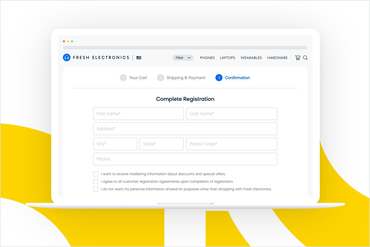
To complete the registration, the customer needs to complete a simple form:
The e-shop designers wanted to make this process as easy as possible for the customer while maintaining high data quality for the shop. People make mistakes all the time, but you can prepare for this by designing a system that expects error.
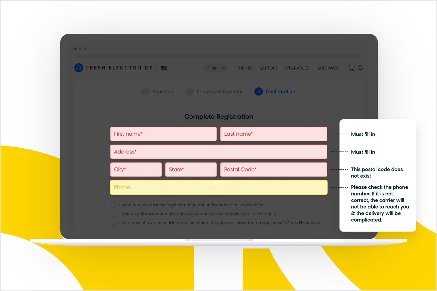
“Expect error” is a type of nudging principle that helps you influence the decision of your customer. It’s simple: Predict where the customer can make a mistake, and prepare a “nudge” — display a tooltip or a message that will guide them in the right direction.
Here’s an example of how nudging works in practice:
Guided by helpful nudges, you complete the order form and you’re done! You’ve successfully bought your new phone.
The final step is actually getting the phone into your hands.
Our e-shop offers three options of making that happen: home delivery, self pickup from a local branch, or pickup from a lockbox of your choosing. This is a great example of how our e-shop provides options (but not too many!) to help create a tailored experience to best suit their customers’ needs.
Bloomreach makes it easy to change every step of your checkout process to find what works for your customers. Different customers have different needs, which is why Bloomreach lets you A/B test different checkout paths to see which works best for your business. The best part? It can all be done with a visual editor. No need for lengthy hardcoding processes. See it in action.
Marketing Psychology and the Future of US E-Shops
Pretty much every company knows the importance of marketing. But most ecommerce businesses aren’t using marketing psychology to get a competitive edge.
Remember the phrase, “innovate or die”?
To succeed, you need to continuously improve your service. If you don’t, you can bet your competition will. The future of e-shops will be all about automation, impressive customer experiences, and smarter choice architecture.
But before you can truly innovate in those areas, you need to understand what drives consumer attitudes and behaviors and how to make the most of your knowledge.
This is where Bloomreach Engagement can help. Our omnichannel marketing automation solution brings all your customer data into a single customer view, allowing you to create personalized campaigns on every channel. Plus, Bloomreach Engagement is powered by Loomi, an AI built for commerce that can help you tap into consumer psychology to drive conversions.
It’s time to boost your sales, increase customer retention, and drive your prospects to make faster purchasing decisions. Explore our use cases to get started.


