This article was created in cooperation with Visme.
In a time when information and data is currency, data visualization is becoming increasingly important.
Understanding your customers is all about analyzing their needs and understanding whether your products or services are meeting those needs.
As you may know already, an important part of this process is visualizing customer data.
In this guide, you’ll learn why customer data visualization is important and how to do it right.
Let’s get started.
Step 1: Define the Main Aspects of the Customer Experience
Customer data visualization is fantastic in terms of helping a business analyze and improve its performance.
It’s for that reason that the first step – before getting to visualizing data – is defining the main aspects of the customer experience.
Why is this important?
By defining the main points of the customer experience and taking informed decisions in relation to it, a company is more likely to boost its customer engagement and make the customer journey a pleasant one.
In a few words, a customer-centric attitude increases customer satisfaction and makes a company more popular and successful.
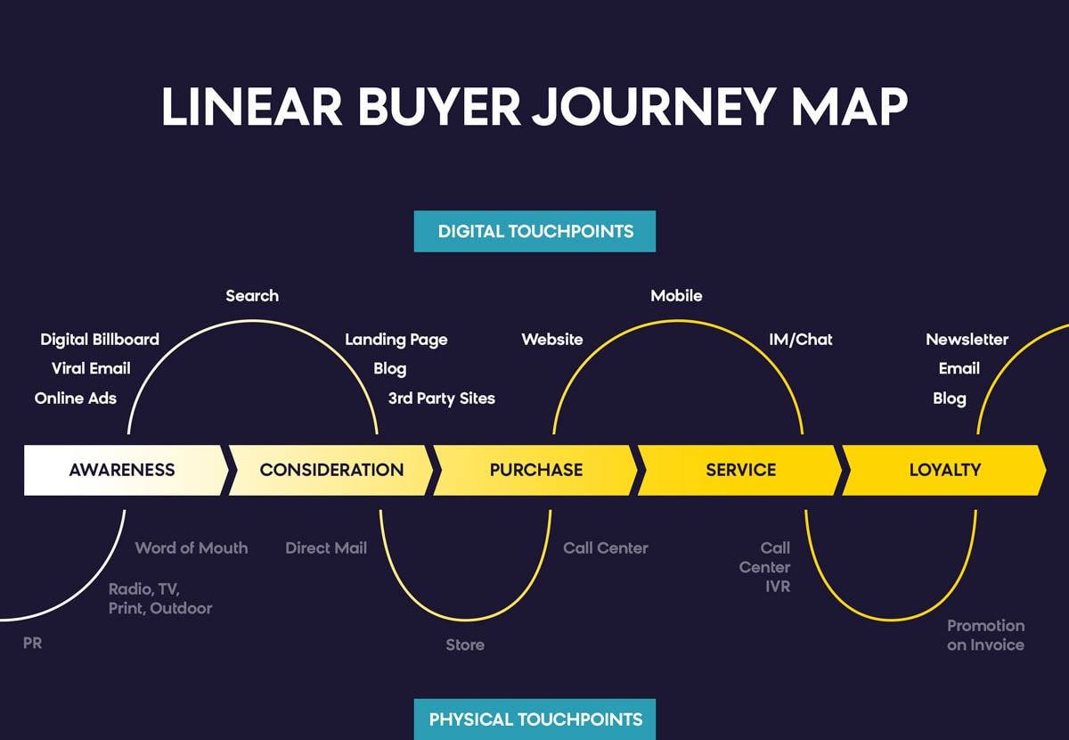
In order for a company to define what the main aspects of the customer experience are, it first needs to understand the steps through which their customers are passing and where such steps might lead.
Have a look at the many customer journey stages, touchpoints, and departments in the graph below.
You need to understand the points where a customer gets in touch with a company’s services or products, as well as all the different departments within a company, that relate to the customer experience:
 Source: Bloomreach
These touchpoints show us how extensive the customer experience is as well as some of the main aspects that companies should take into consideration when analyzing the customer journey — and while creating and shaping a marketing plan.
Step 2: Choose the Right Data to Visualize
The second step in terms of our process is to choosing the data to visualize.
In other words, out of all the different data a company might be collecting, for visualization you need to choose the data that will actually give a company insight and help it improve.
Data visualization can take the form of any visual format. Some of the most common formats for data visualization include a wide variety of chart types, like line charts, bar charts, and pie charts.
Other formats like heatmaps, word clouds, scatter plots, and infographics can all be useful as well. There’s a wide range of data visualization formats, as well as visualization techniques, out there.
Before we discuss some of these in more detail, let’s see the different types of customer data you can collect.
Type 1: Visualize Customer Support Data
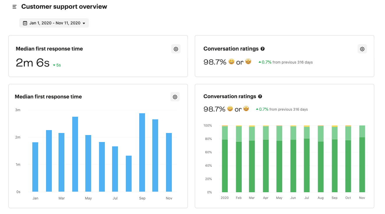
The first type of data that is very useful for companies to visualize is customer support data.
Customer support is a customer-facing service. Most importantly, it’s a big part of the overall service that a business is providing to their audience. And a great support team is one that monitors its performance and constantly tries to improve.
Customer support data can help in terms of collating different data in relation to the customer service that a company is offering.
Visualizing customer support data can be useful for a company — and its support team — for a number of reasons:
- By getting and visualizing data on how often individual customers are contacting their support team, companies are more likely to provide better customer service.
- It gives a very clear idea of the quality of the service that the customer support team is providing.
- It highlights and brings awareness to the strengths and weaknesses of the support team, thus making it easier for it to improve.
- It makes the support team proactive.
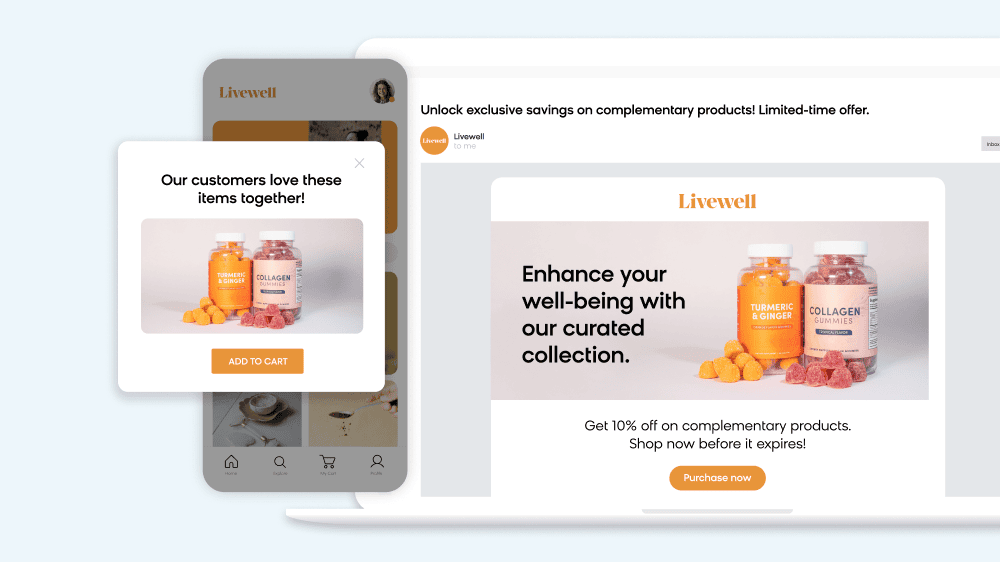
You can also visualize data from your customer loyalty program and other outlets to ensure your efforts are successful.
 Source: Bloomreach
Type 2: Visual Website User Behavior Data
The second type of data that can be highly beneficial for businesses is website user behavior data.
Any sort of visual elements that can give a company a clearer idea of its website users’ behavior can make a real change in terms of improving the business and boosting its performance.
Here’s some of the main benefits of website customer behavior data visualization:
- It helps a company effectively deal with a large amount of data that’s related to user behavior.
- It can be highly beneficial for a company to understand a great deal of what their customers are experiencing when visiting their website.
- An ecommerce store or other website can be made more user friendly and effective in terms of keeping the audience engaged.
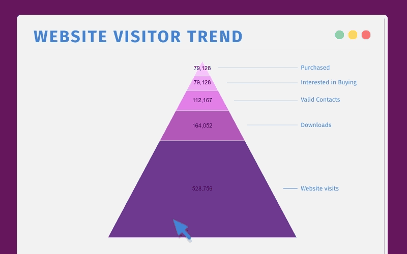
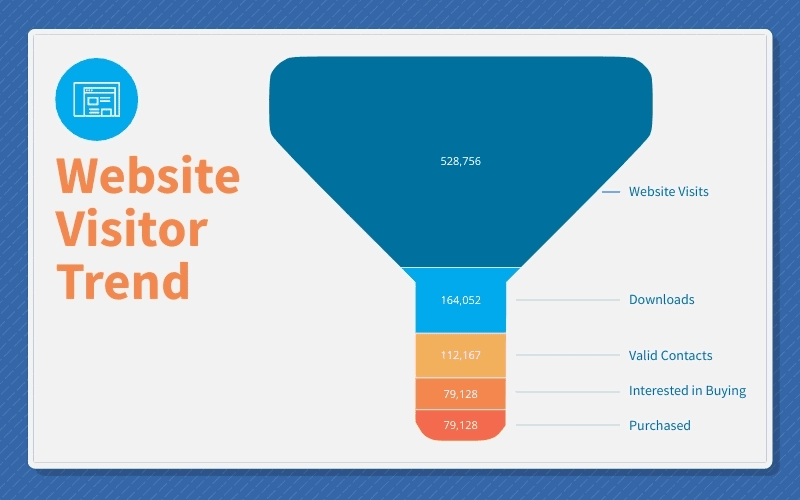
The website visitor trend pyramid chart template that follows is a fantastic example of how customer behavior data visualization might look.
 Source: Visme
The same applies to this data visualization example that can be an extremely helpful visual in terms of identifying and analyzing customer behavior:
 Source: Visme
As you can see, both the pyramid chart and the funnel chart above give data in relation to the number of purchases, website visits, people interested in buying, etc.
All this is valuable data that can significantly help a company understand its audience.
Below, you’ll find the third and final type of data that companies should consider visualizing.
Type 3: Visual Product Data (Mainly for SaaS and Ecommerce)
The last type of data that can be useful, mainly for SaaS and ecommerce businesses, is product data.
As I mentioned earlier in this post, data visualization can be a helpful tool in identifying trends within an ecommerce business, for example.
Product data is in the same vein. It gives insight into what the audience’s favorite products are, as well as showing any kind of preferences like style, color, etc.
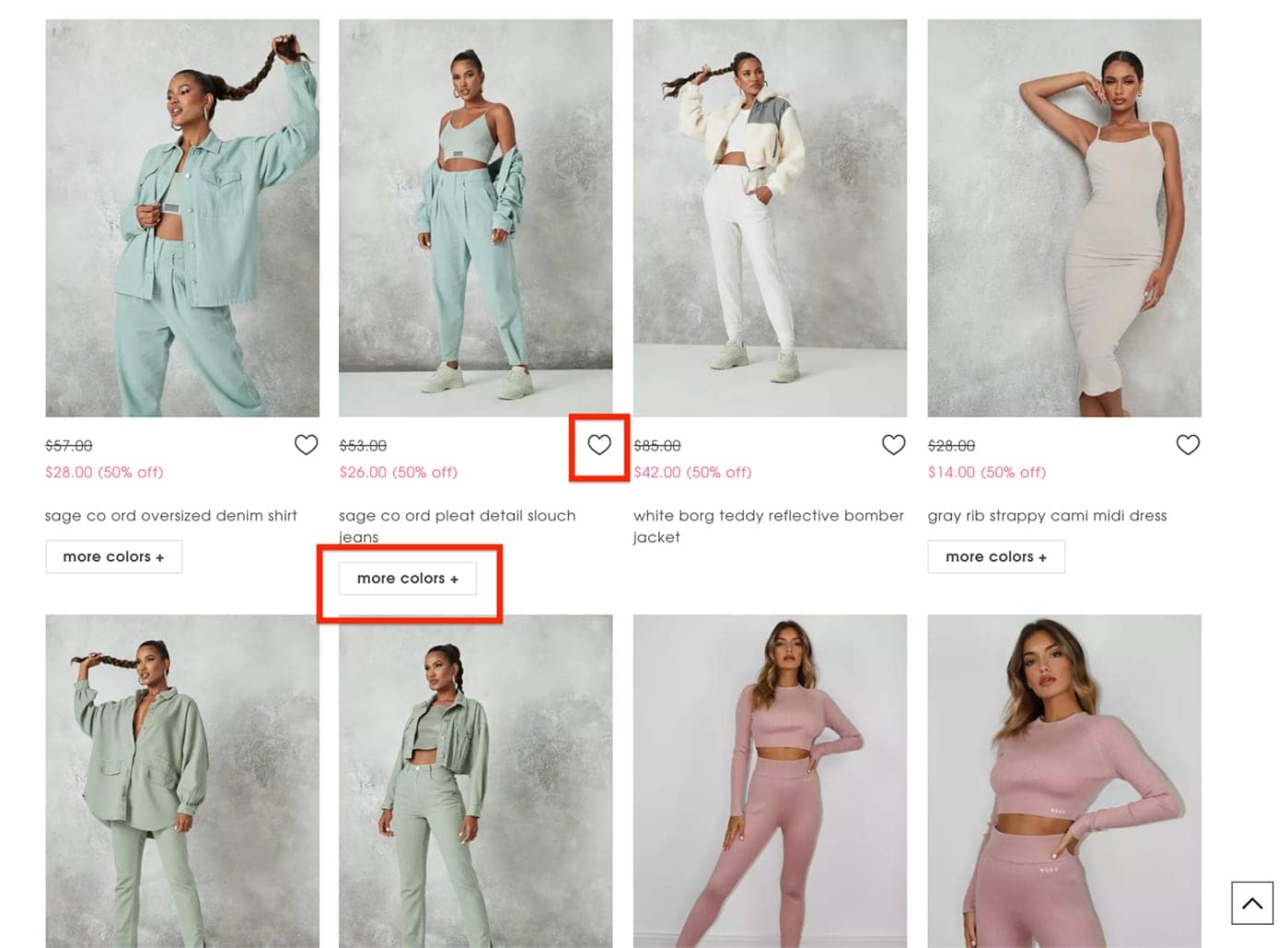 Source: Missguided
Let’s say that a company wants to visualize data for the products that are shown above.
The data will provide information about the instances that each one of these products was bought, liked, or saved.
Additionally, in case a product is available in more colors – like the one I’ve highlighted above – then the sales team of the company will also know which color sells more.
Knowing any kind of detailed information in relation to your products is important because it helps you build a more effective marketing strategy. Plus, it promotes and creates products that will sell more than others.
Let’s now move on to the third step: choosing the right tools for data visualization.
Step 3: Choose the Right Data Visualization Tools
The second to last step that’s absolutely necessary in regards to customer data visualization is choosing the right visualization tools.
As you may have guessed already, making sense of your data is just as important — if not moreso — than collecting it.
In order for a company to be able to analyze its data and perform a business intelligence (BI) process, it first needs to visualize that data in the most appropriate and effective way possible.
Simply put, the data needs to be displayed in such a way that it will make it easier for the company’s teams to understand. It can’t just be a mass of numbers. It needs to communicate.
In the process of building the right line graphs, bar graphs, and other formats of data visualizations that will help you understand your data, there are some tools that can be very useful.
A Real-Time Customer Data Platform
Understanding your data in the present moment is an invaluable capability. It is the most important step in building visuals that produce thoughtful and relevant insights. That’s why a customer data platform, like Bloomreach Engagement, is an essential tool for managing customer data and customer analytics.
The process of collating and tracking data that companies receive from various sources can be time consuming, and can sometimes seem impossible. But with Bloomreach’s real-time capabilities, you get a unified customer view where all data for each customer is collected.
With a customer data platform, you can capture insights from your ever‑changing data and dig as deep as you want to reveal connections between seemingly unrelated data points. The dynamic nature of all your reports, analysis, and dashboards ensures that your data insights are accurate and always up‑to‑date.
Plus, Bloomreach uses advanced machine learning to harness that instant data and offer a deep understanding of your audience, like a customer’s future behavior and the ideal segmentation for your audience.
Bloomreach provides an instant look at all the information you need, whenever you need it.
An External Data Visualization Tool
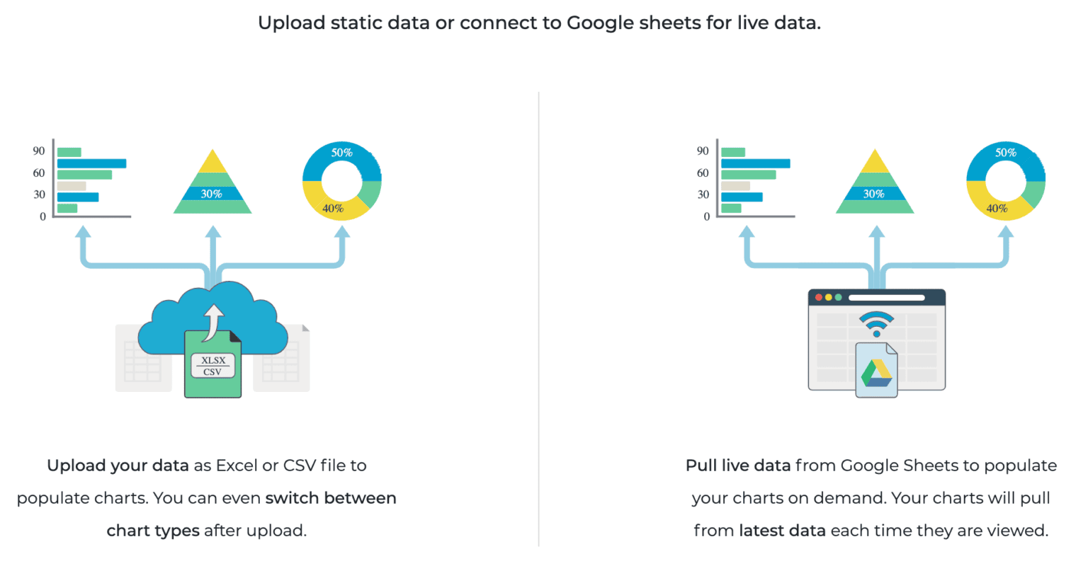
Now that we have all the data we need, we’re ready to get a clear picture of your insights. If you’re looking for a data visualization software that allows you to connect your real-time dashboards to create reports, infographics, presentations and more with your customer data, Visme is the perfect tool.
Visme offers a wide range of apps and widgets that can help anyone, whether you’re a designer or not, build compelling and meaningful visualizations for all types of data.
Once you have a data visualization software in place, the options are endless. From customer information like demographics to customer behavior outlines, you can conjure up visuals to add narrative to any data points.
Visme also makes it easy to input your data into their software. You can use real-time data or upload fixed data that it has already received to populate all formats of data visualization.
Again, the options are limitless. All you need is the right tool to make great data visualizations.
Step 4: Get Actionable Insights and Make Better Decisions
The last step is the most satisfying one — putting all the pieces together to reap the benefits of your data and get actionable insights that will make your decision-making process better.
You’ve defined the most important aspects of your customers’ experience with your business. You’ve chosen the data you need to understand, act on, and improve by using the right tools for the job. Now it’s time to put those insights to work and make significant progress.
Because your data is a powerful resource that can make your business better. And there really is no end to the refinements you can make when your understand the story it tells.
Conclusion
The data each company might find useful to collect and analyze is entirely up to them and their needs.
However, some main categories of data, like the ones mentioned earlier in this post — customer support data, website user behavior data, and product data — are crucial to help a business grow. And visualizing these insights are important steps in understanding the adjustments you need to take for next-level results.
Simply keep in mind that compelling charts, graphs, and all other formats of visuals can help you improve your business and boost your performance.
Following the steps in this blog will help you generate leads and create a basis of loyal customers that are happy with what you do and what you have to offer.
Just remember, data is the key!