It is a universally accepted fact that pop-ups and banners are annoying. So how come every other brand and website has one?
Because, against all of our best judgments, they work. The key is to get the context, content, and audience right.
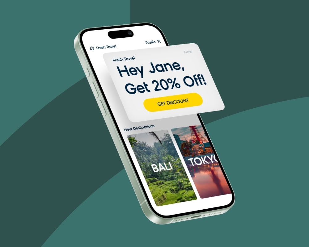
Instead of treating pop-ups and banners as digital loudspeakers, think of them as another communication channel to reach customers, and apply the same personalized and segmented approach. Ask yourself: is the content relevant to everyone who will see the banner? Is that pop-up offer attractive enough? Does the dialog box appear too soon and/or too often?
While lead generation and email capture forms are the most popular pop-ups out there, when done right, they can be very powerful for more than just list growth. Here’s a non-exhaustive list of things you can achieve with pop-ups and banners:
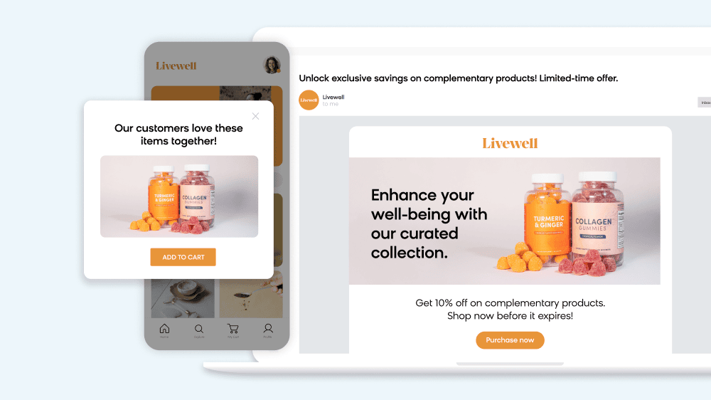
- Drive action by showing a standard social proof banner (“X customers are also looking at this”) or location-based social proof banner (“Someone in New York just bought this item”).
- Improve retention by showing an on-exit banner when the cursor is moved to leave the website
- Improve brand love by showing COVID-related information with quick links to reassure customers during the pandemic
- Target a predefined high-intent (or low-intent) audience with personalized content
- Target first-time visitors with relevant information based on time spent on page or number of sessions
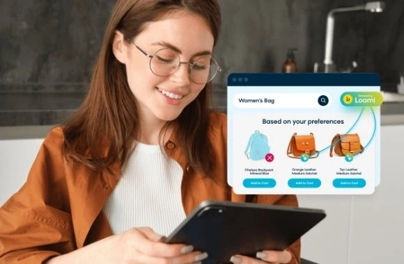
- Gather zero party data from customers to help with future personalization

- Surprise and delight loyal customers with unique personalized perks and messages
- Personalize messaging based on the channel that the user clicked-in from like email or paid ads
- Improve conversion by showing an offer to customers who are unlikely to convert without it (and hiding it from customers who will convert anyway)
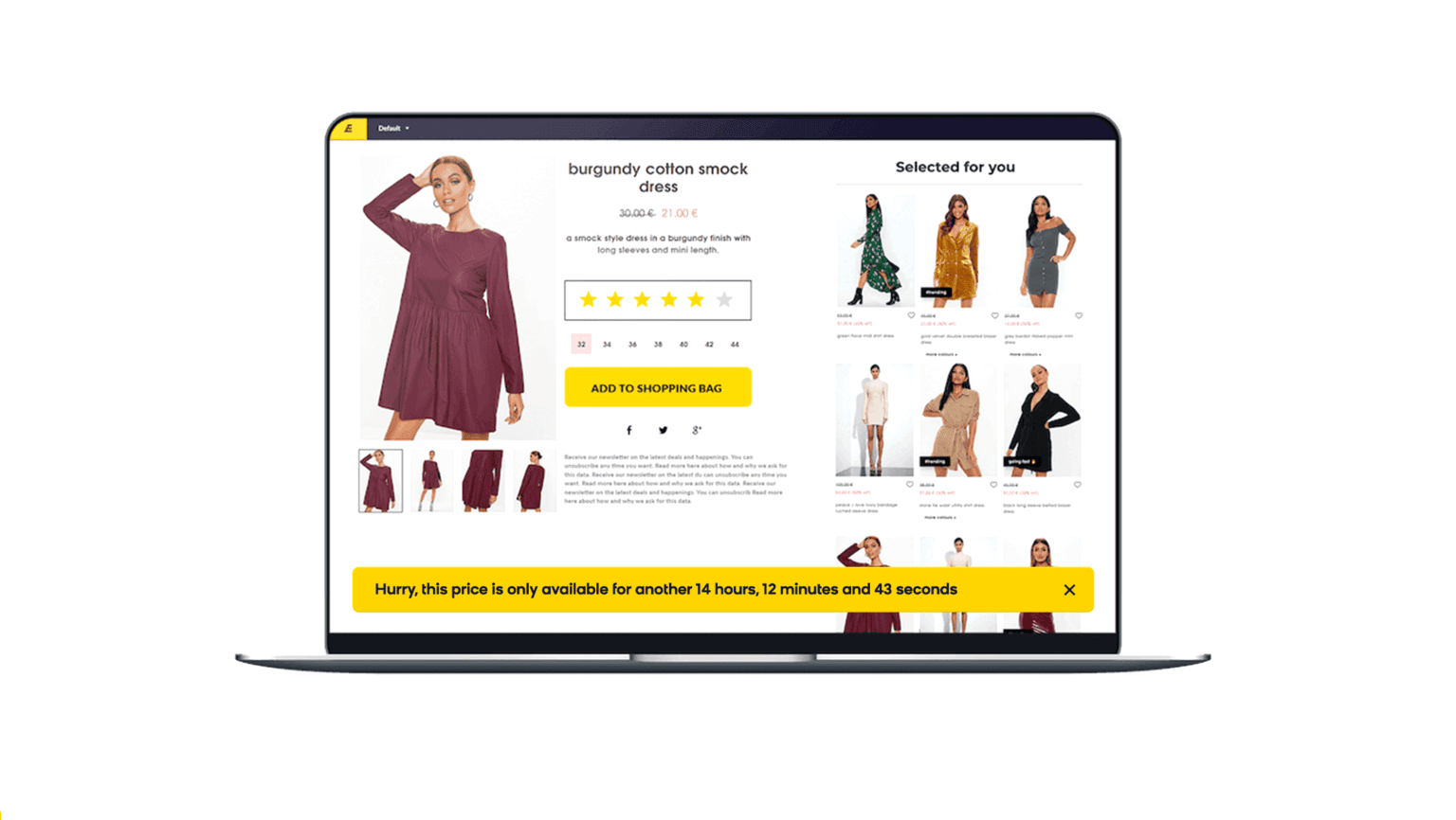
Take ebuyer for example, one of the UK’s leading independent online electrical retailers with four million registered customers, offering over 40,000 different products. It used Bloomreach to implement a countdown banner that would display a ticking clock only on the daily deals product page. Within 6 weeks, the countdown banner saw a 16% uplift in conversion rates against a control group. Ebuyer was also able to see a 3% uplift in revenue by selectively showing product reviews from Reevoo only to visitors who had started their first session. This time-based personalization strategy worked as it enforced brand credibility only when it mattered, and excluded anyone who already knew and trusted the brand.
Another client, a UK-based, men’s clothing retailer segmented the way it displayed its free-delivery banner and saw conversion rates go up by 11%. The banner showed one version when a threshold was reached (minimum eligible purchase price) and another if the threshold was not met, which showed the remaining value needed to reach the threshold (*some JavaScript knowledge was required for this segmentation).
Bloomreach supports banners and pop-ups through our web optimization module called weblayers. So just like email and SMS, weblayers enjoy the unique advantage of being powered by customer data from our Single Customer View. This means that you can be super selective about displaying your banners and pop-ups in a way that make them as relevant as possible (which make them far less annoying). Plus, to make it easy for anyone to set these up, weblayers come with several fully customizable, pre-defined templates that require no coding skills. From a lead-gen pop-up to a slide-in banner with personalized recommendations, marketers can design personalized weblayers within minutes.
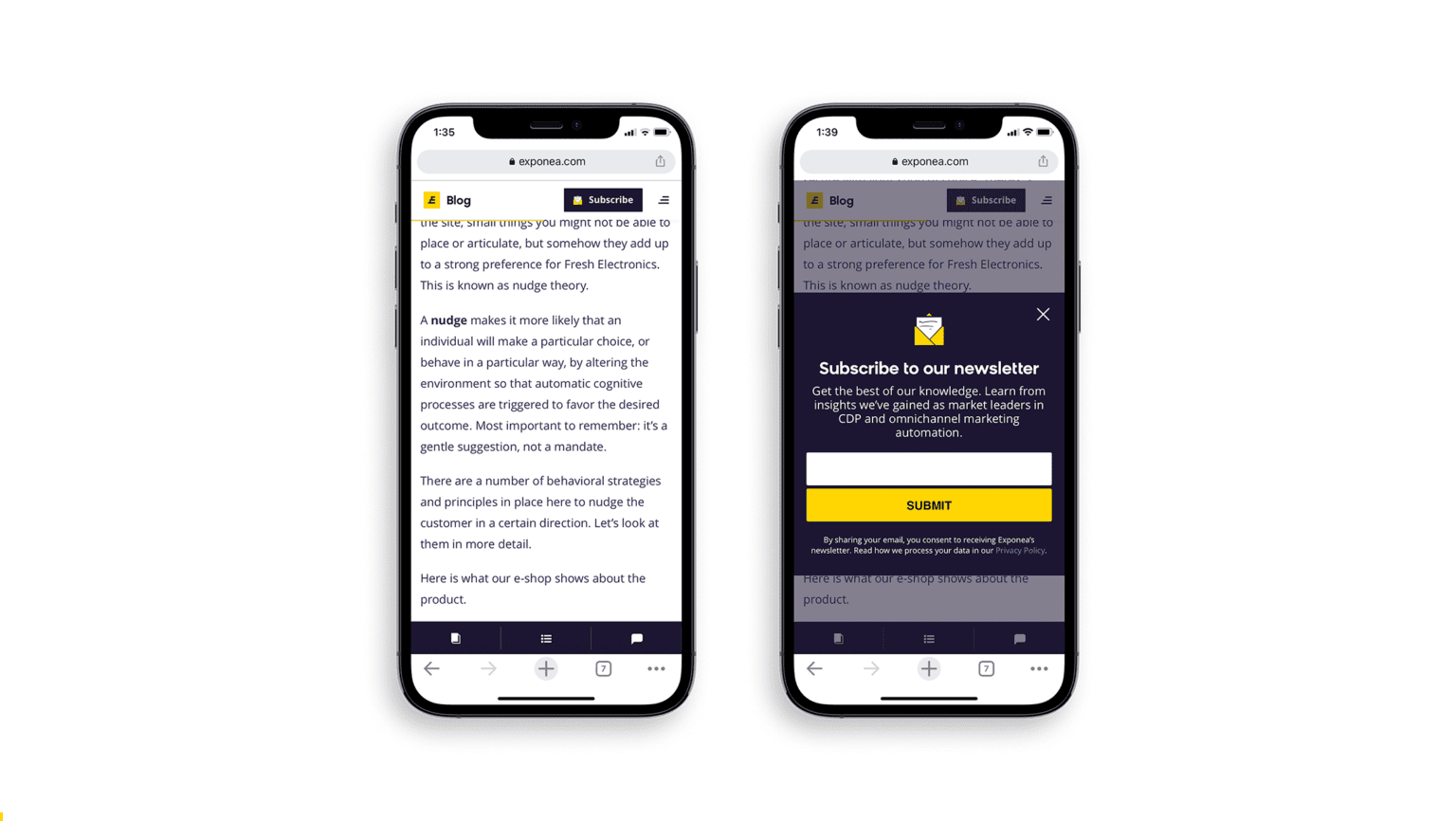
One important thing to keep in mind while designing your pop-ups and banners is to think about how it will affect the mobile experience. It’s bad practice, and incredibly annoying, to have a pop-up consume the entire screen space. Our predefined weblayer templates, for example, are all mobile responsive. But it’s also about how you define your strategy. Take a look at how we think about this on the Bloomreach Blog. We custom-coded our weblayer so that it doesn’t pop up in the middle of someone’s screen uninitiated. We first created a small weblayer as a subscribe button that’s pinned on top of the page that doesn’t interrupt the user’s reading experience but is still visible. Once clicked, it opens up a sign-up form. We believe this makes for a better user experience.
There are still plenty of websites that show newsletter subscription pop-ups in the middle of the screen as an aggressive user acquisition strategy. Sure, it might lead to short-term list growth, but the main question to ask here is if you’re looking to create long-term value. If those additional email sign-ups are also leading to an increase in unsubscribe rates and spam rates, then they’re probably not worth chasing after.
There are several ways you can make pop-ups and banners work for you. If you’d like to talk about it, send us a message on that little pop-up chat box to the right. If you’re an existing Bloomreach customer looking to improve conversion rates, Bloomreach has several weblayer Plug&Play use cases developed to help you hit your goals crazy fast.